Master Mobile App Design: Create Top UI/UX Apps
Blend stunning aesthetics with seamless functionality. A practical guide to mobile app design, the best application UI design principles, and the UX decisions that keep users coming back.
Creating an exceptional digital product takes more than clean backend code. It takes mastery of mobile app design — the discipline that decides whether someone finishes a task in four seconds or abandons it in four taps.
Look closely at the best apps for UX and they share one trait: stunning visuals wrapped around genuinely intuitive functionality. Neither alone is enough. This guide walks through the structure, interface craft, visual systems, platform conventions and testing loops behind the best application UI design in 2026.
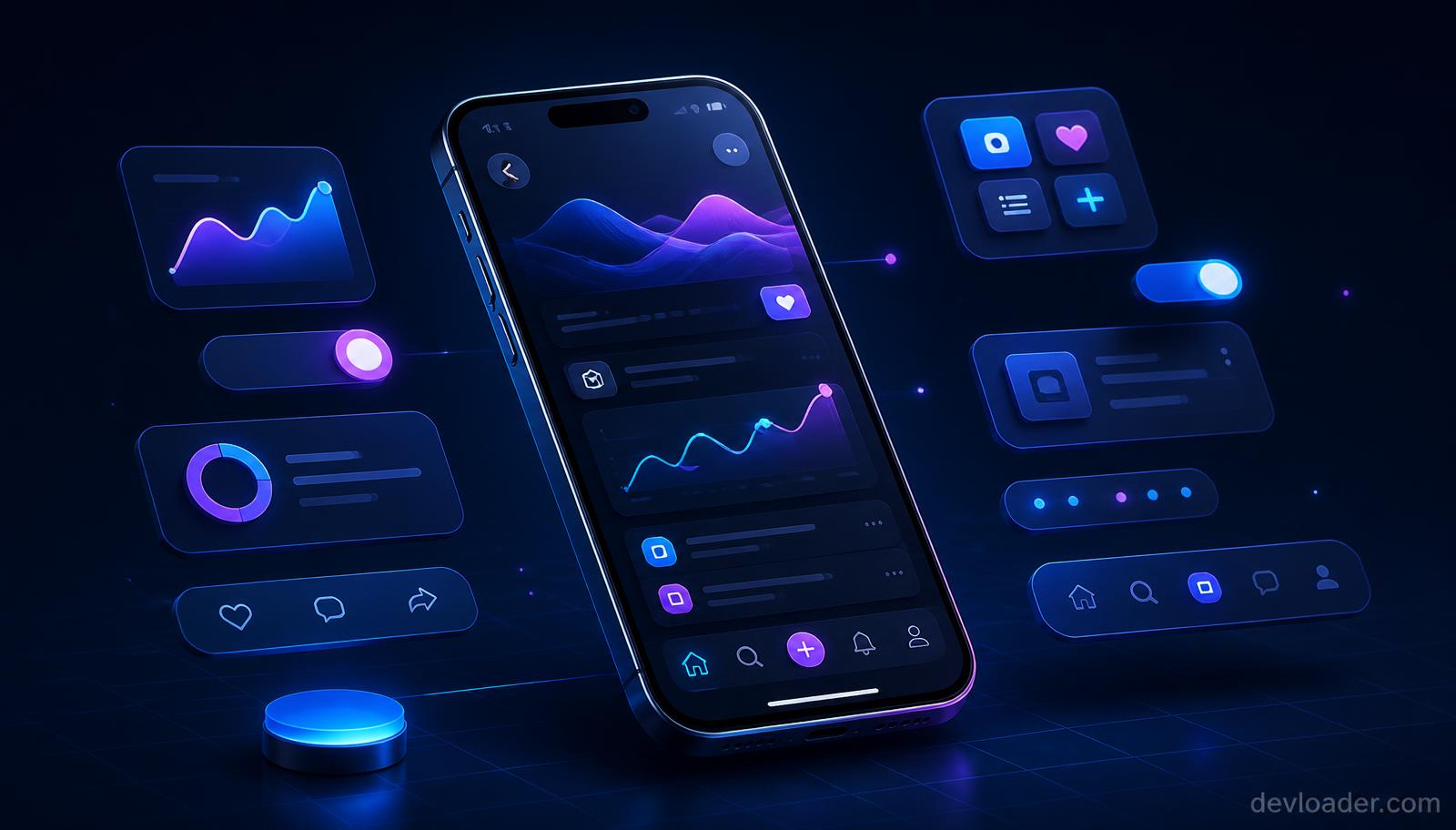
*Every polished app interface is the visible surface of a design system underneath it — reusable components, consistent spacing and predictable interaction states.*
Key takeaways
- Structure first: wireframes and user journeys prevent expensive rework later in the build.
- Reduce cognitive load — the best app interface makes the next step obvious without explanation.
- Visual hierarchy, 44pt touch targets and 4.5:1 contrast are the baseline, not the ceiling.
- Respect iOS Human Interface Guidelines and Material Design instead of forcing one UI onto both.
- A design system keeps a growing product visually coherent and cheap to extend.
- Usability testing on prototypes finds friction before engineering pays for it.
The foundation of good app structure
Good app design always begins with a documented plan. Before anyone picks a colour palette, the team needs to know what the product does and in what order.
Moving deliberately from low-fidelity to high-fidelity wireframes lets you map core functionality while changes are still cheap. A grey box costs nothing to move; a built screen costs a sprint. During this phase you also map user journeys for onboarding, because a frictionless first run is the clearest hallmark of the best user experience apps.
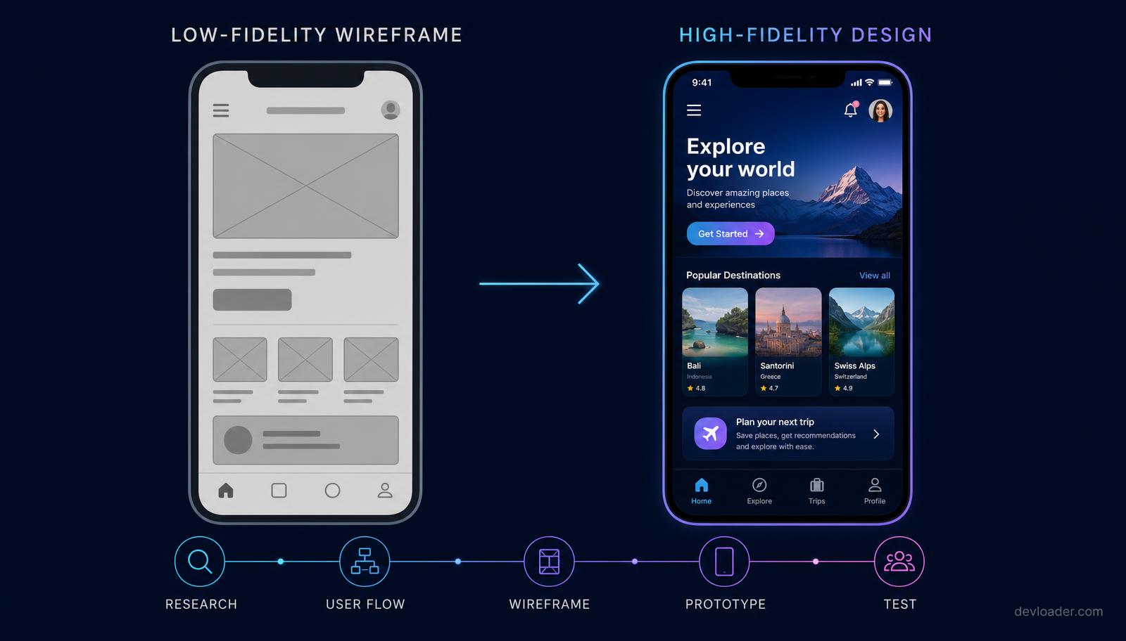
*The low-fidelity to high-fidelity progression keeps early decisions about layout and flow separate from later decisions about colour, imagery and brand.*
Strategic simplicity is your greatest asset when laying out screens. Reducing cognitive load in complex workflows means users never feel overwhelmed by a critical task. The best app interface guides someone from one logical step to the next, which is why good app design is usually invisible — nobody notices the screens that just worked.
That planning discipline mirrors how a strong engineering team scopes a build; the same rigour we describe in our guide to web application development services applies to product design.
Mastering mobile app UI design elements
Achieving the best application UI relies on clear visual structure. Visual hierarchy for small screens directs the eye to the most important thing first — through deliberate sizing, generous negative space and one obvious primary call to action per screen.
Day to day, the mechanics matter just as much. Gestural navigation and touch target sizing decide whether an app feels precise or frustrating. The best mobile app UI accommodates different hand sizes and grip styles, keeps interactive elements comfortably tappable, and places primary destinations within thumb reach. Thoughtful home screen structure sets the tone from the launch screen onwards.
Visual aesthetics, typography and inclusivity
Crafting the best app user interface means caring about micro-styling. Colour theory sets the psychological tone of an application while reinforcing brand identity. Typography best practices for mobile readability — legible sizes, sensible line length, strong contrast — make content scannable rather than merely present.
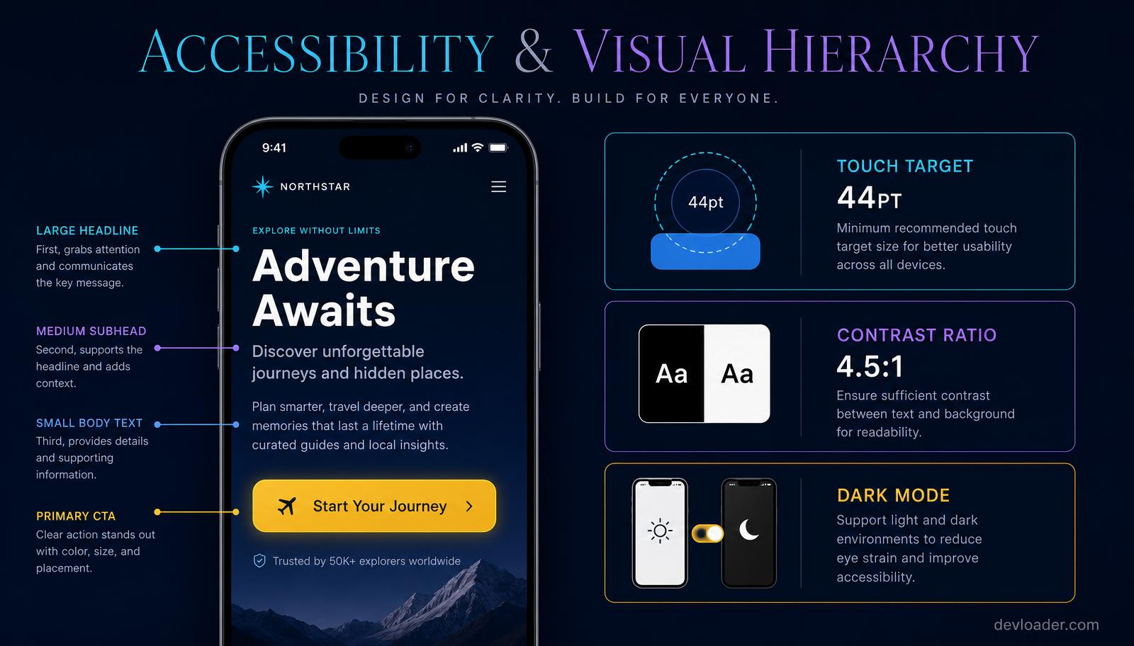
*Accessibility standards and visual hierarchy reinforce each other — larger targets, stronger contrast and clear typographic scale improve the experience for every user, not just those with impairments.*
Dark mode is now an expectation rather than a perk. It reduces eye strain, saves power on OLED panels, and signals that the product respects how people actually use their phones. Combined with accessible interfaces built to WCAG standards, these choices make an app interface design both inclusive and striking.
Frameworks: platform guidelines and design systems
Design application mobile projects have to respect platform conventions. The differences between the iOS Human Interface Guidelines and Material Design are real: Apple leans on translucent depth, clarity and restrained typography, while Material uses grid discipline, elevation and bold, purposeful colour.
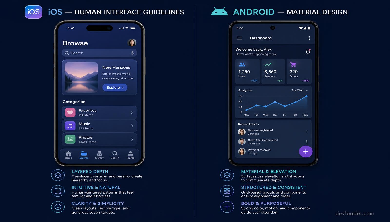
*Adapting navigation patterns, typography and depth cues to each platform is what makes an application feel native rather than ported.*
Design decision — iOS convention — Material Design convention
Primary navigation — Bottom tab bar — Bottom nav or navigation drawer
Depth cue — Translucency and layering — Elevation and shadow
Primary action — Prominent inline button — Floating action button
Back behaviour — Left swipe and back chevron — System back gesture
Typography — SF Pro, tight hierarchy — Roboto, grid-aligned scale
To hold visual consistency as the product grows, build a scalable design system: a shared library of tokens, components and interaction states. Agencies delivering the best mobile app design rely on these systems to keep every future release cohesive — and the same shared-component thinking drives cross platform mobile development, where one design language has to hold up on both iOS and Android.
Refining the experience through testing
Even structurally sound modern mobile app design needs real-world validation. Usability testing on prototypes uncovers hidden friction before coding starts, and it consistently reveals that people use products in ways the team never anticipated.
Formal validation continues right up to release. Running structured user acceptance testing confirms that real users can complete real tasks in the finished build, not just in the prototype.
Once the fundamentals are solid, shift attention to delight. Micro-interactions — a checkmark that draws itself, a subtle button press, a pull-to-refresh with weight — provide feedback that makes an interface feel alive. Combined with navigation people can predict, they are what turn first-time installs into retained users. Convoluted menus churn users; crystal-clear ones build habits.
Frequently asked questions
What makes a good mobile app design? Clear structure, an obvious primary action per screen, accessible typography and contrast, platform-appropriate navigation, and fast, predictable feedback on every interaction.
How long does mobile app design take? A focused product typically needs three to six weeks from research and wireframes through high-fidelity UI and a tested prototype, depending on screen count and complexity.
Should iOS and Android look identical? Share the brand, the content model and the component logic — but adapt navigation, gestures and depth cues so each platform feels native.
Design and build it with a senior team
Devloader designs and ships production mobile products end to end — user research and journey mapping, wireframes, high-fidelity UI, a documented design system, accessibility review against WCAG, and engineering handoff that developers actually enjoy working from. Explore our design and engineering services, see recent product work in the portfolio, or read more in our resource hub.